Monday, January 25, 2010

Ponyo Contest


Ponyo Contest, 2010. pencil

Colored pencil sketch done for a contest on the deviant art website to create a splash banner clickly for the Ponyo movie.


Thursday, January 21, 2010

Volcanic Planet


Volanic Planet, 2010. Photoshop.

Created a photoshoped planet with the help from a tutorial.

Wednesday, January 20, 2010

Dying Neda


Dying Neda, 2010. Corel Painter XI.

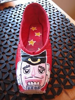
Nutcracker Ballet Shoes


Nutcracker Ballet Shoes, 2009. Acrylic paint.

Some slippers I painted for a charity in Christmas 2009.


Tuesday, January 19, 2010

Sleeping Owl II


Sleeping Owl II, 2009. Corel Painter XI

Sleeping Owl

Sleeping Owl, 2009. Corel Painter XI.

Monday, January 18, 2010

Wadleif, design for a Cirque du Soleil type show

I was boasting out loud the other day after seeing a Cirque du Soleil commercial that I could design one of those shows.

My wife said, “Well why don’t you?”
“Well…alright” I said.

So I got to thinking about characters and a story arc. The story centers around Wadleif, a forest custodian that falls in love with an unobtainable Forest Queen. After seeing her he tries to become things he is not in order to impress her. Throughout the show he tries to copy the performers, much to the comic delight of the audience. He fails and in the final act either Wadleif hurts himself and the queen takes pity on him -OR- he gives up and acts like himself which the queen admires and in the end creates a love for him.

Here are the main characters I’ve created. These are the actors and not the performers, they would just have themed costumes that would work with what ever stunt they were doing.


Wadleif, carries a broom that he uses to sweep the forest with. It has flowing roots so that it actually functions. At the climax of the story it will light up similar to how it is depicted here. His character is not intentionally funny, but we laugh at his attempts to please the Forest Queen. However, we commiserate with him by the way in which his boss, the Lichen Monster character, treats him. He is an everyman.

The first of the clown trio is the Rock Clown. He would be played by a short portly man. He is the Hardy to the Twig Clown's Laurel. The pair function mainly as a group and are always seen together. The Twig Clown would be played by a tall lanky man. He is the master of ceremony for the show and the only member of the cast to speak English. The others might use a word or two, but speak in stage gibberish for the show. The two clowns are afraid of nearly everything - they run amok during stage transitions, and freak out if approached by cast members. They are not afraid of the Mole Character and the audience, esp. females in the crowd. A staged joke during a crowd participation would be the Twig Clown's top twig becoming erect while interacting with a female audience member.


The final clown member of the trio is the Acorn Clown. She would be played by a petite athletic woman. Her character is a lesbian and in love with the Forest Queen and her Guards. She wants very much to be a Guard and is very forward. She constantly bullies the other clowns for being such cowards.

The Forest Queen role is mainly just an aesthetic one.


The Forest People are meant to be on the periphery. They move unseen around the crowd and in the rafters and hide in the set designs (prop foliage and such). The black suit on the right is how they would look before they are revealed. You might see a flicker of their lights, I want the audience to think they are seeing movement, but not make out what it is. In the climax of the show they move down to the stage and the suits would light up like shown on the left. This effect is similar to suits at the opening ceremony of the Chinese Olympics.

Lichen Monster is Wadleif's 'boss' and berates him at every step. He stomps small forest creatures, is generally evil, and is of course shamed somehow during the climax of the story.

The Queen's Guards consists of three contortionists and are the only actors to actually preform.


The blind Mole Character burrows around the stage and pops up thru trap doors for comic relief during stage transitions. He falls in love with a tree stump that has a silhouette just like his. He brings gifts to it. The two male clowns aren't afraid of the Mole because of his apparent small size. They constantly chase him and try to eat the him. It is revealed at the end of the circus that the Mole is in fact huge, played by two or three people much like the Chinese dragons seen in festivals. This causes the clowns to flee the stage in terror.

LED lights would be used in the costumes with foliage on them i.e. the Lichen Monster's necklace and Wadleif's shoulders. This is to give a floating orb or firefly effect around them. The stage lighting would be etherial and give an enchanted forest feel. Small pin lights at the ceiling of the arena would simulate a starry night. At the climax of the story some of those lights would descend toward the audience, similar to a room full of fireflies. I'd like to have a floating seed effect somehow, similar to the forest spirit scene in Avatar. Smoky wild rave or club type atmosphere. Music would be a cross between Animal Collective, a jungle sounds CD, and Bobby McFerrin voice effects.

Sunday, January 17, 2010

Space Wolf -- Battle Aftermath


Space Wolf -- Battle Aftermath, 2009. Corel Painter and hand sketch.

Finally finished this rather pensive looking Space Wolf marine from the Warhammer 40,000 universe. It is the first thing I have done in Painter and has been really good practice. I need a bit more practice with clouds, but I am pleased with how the actual marine looks. It is still awkward to paint with a mouse. It has taken some time to complete - worked on the figure during Christmas and painted the background a few times after not being satisfied with the composition. I might have gone a bit too far with the floating fire embers; it was a cliche I just could not resist.

Wednesday, January 6, 2010

Portfolio III


This portfolio consists of some of the great work I got to be a part of at Dougherty + Design Group. The two main projects that became the focus of the firm were La Isla Acapulco a behemoth of a lifestyle center in Acapulco, Mexico. It had 12 buildings similar to a large Department store each, a moat with flowing river complete with gondolas, small food vendors and two parking decks. It was quite huge, the central building carried a "ship sail" type sculpture with an elegant LED light show and 3 monstrous TV screens.

The second project was Paseo Campeche, also in Mexico. It was a large scale mall with two anchors, a movie theater, bowling alley, and family entertainment space. It had 4 outlying buildings and a parking substructure as well as parking deck.

Thesis Models


Models, 2004-2005. paper and chip board.

Thesis Site Sketch


Landchunk, 2004. ink pen sketch.

Just a little site sketch I did.

Tuesday, January 5, 2010

Thesis Sketches


Sketches from my Thesis year, 2004-2005.

My Architectural Manifesto c. 2003

In a world where information travels at light speed, the present no longer exists. We live in a conglomeration of the future and the past. In our media and technology driven culture history is made while we are still in the act of doing. Integration of things that now seem banal in modern life has changed our reality to that of a cartoon. Designer drugs, SUVs, living room wars, main street architecture, reality TV. These and many other factors that we have accepted with complacency have turned our lives into satire. Architecture must reflect this parody and show it its faults. This is the role of architecture in the shambles of our society. If this cartoon life is what the population has gotten used to, then this is what we will give them. Architecture based in reality, yet not quite real. A tongue in cheek architecture with a certain campiness is what should be strived for. An architecture that is as comfortable in Disney World as it is in our real world. The tools that are used to do this are having faith in the spontaneous line. Revision only breeds boredom. Inherent geometries can be found to work off of in the beginning planning. Thi sma kesthe wo rkse em mor e ofa who le cre ati ng orde r the nbre ak ingit le nds ire gula rities to th ebu ildi ng:”>out o ford er…co mesch aos and vi ce v? ersa fi na lly con tra dictio n tobe nai ve and sa ge ly9 to ve il and unve il to lur (e in a n dfen doff t obe t he sed ucer and t he se du ced all a tt hes ame tim
e


This is my personal manifesto I wrote for a project back in 2003. It's somewhat funny to see I still agree with most of it here seven years later. You can tell I was reading a lot of Tschumi and Venturi.

Thesis Circulation Model


Thesis Circulation Model, 2004.

This model was completed mid-term during the thesis year. It illustrated the procession the visitor would take to enter the geology museum.


Bull Street Crematorium


Bull Street Crematorium Model, 2003.

Another Savannah College of Art and Design project, this one was an adaptive reuse of an existing building that was to become a crematorium. I used the concept of 'clamping' (we were given the problem of meshing the new construction to the old through the use of a Russian Constructivist method)


Mulberry Grove Project


Mulberry Grove Visitor's Center, 2003. SCAD studio project done w/ John Dumsick.

This was our scholarship winning design for a small visitor center located on the marshy Georgia coast. The four galleries had unique structures running down their centers. These structures represented the content of each gallery.

The Plantation Gallery mimicked the cotton gin (which was invented on this site), the Commerce Gallery took the shape of ship's sails (given the close proximity of the Savannah port), the Urban Development Gallery was inspired by the Savannah squares (delineated parks laid out around the town), and the Ecology Gallery drew upon the look of a native bird.

The real lynch pin (and what ultimately won us the competition) was the look-out post by which you would orient yourself to all the historic sites the place had to offer. By looking down along the center of the galleries it would point to where pertinent events occurred on the site.


Flower Diagram


Flower Diagram, 2003. Photoshop.

A little diagram I did for a landscaping project.

Landscape Project

Landscape Project, 2003.

A humorously themed project for my landscaping class about a conversation between Le Corbusier and a caveman. It follows human's experience in landscape and how we came to dominate it.

Ein Hud Model


Ein Hud Model Photo Collage, 2004.

A photo collage I made at SCAD for a project in Israel. The building was a community center.

Monday, January 4, 2010

Space Wolf -- work in progress


Work in progress for an homage to Warhammer 40K. It's from a sketch that has been painted in Corel Painter XI. More to come as I finish the background.